After revisiting the Nelson-Atkins Museum of Art and loving its collection but its starchitectural addition not so much, I couldn’t have picked a better follow-up than the Minneapolis Institute of Arts, which, like the Nelson-Atkins, has a grand neo-classical original building, designed by McKim, White and Mead that has posed a challenge for expansions. You don’t don’t want new wings competing with, or overshadowing this:
Well, not only does the 2006 addition by Michael Graves, which expanded upon both the 1915 building and Kenzo Tange’s minimalist 1974 addition, not compete with the original, it dares to be dull in a way that drew yawns from critics like Blair Kamin when it first opened:
Some neighbors of the museum liken his addition to a mausoleum or a big-box store, a not-so-veiled shot at the wing’s chief sponsor, Minneapolis-based Target Corp. (which also happens to pay the Princeton, N.J., architect to design household products). Indeed, Graves’ mostly windowless expanses of stone turn a forbidding face to the street.
Good point about the apparent conflict of interest with Target.
His main entrance facade is better, its limestone walls, with their niches and thin columns, simultaneously conveying the weighty feel of stone and the lightness of folded paper.
The interior also has its moments, like a barrel-vaulted reception hall that reveals Graves’ talent for enlivening traditional forms with rich materials and colors. But, at root, it’s flawed, the result of a clash in sensibilities between Graves’ postmodernism and the modern spirit of the museum’s curators.
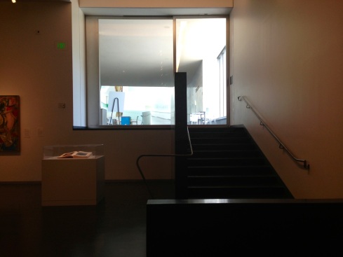
The curators, who furnished the second- and third-floor galleries chiefly housing 20th Century and contemporary art, faithfully continued the crisp aesthetic of the museum’s existing galleries, but at a price. They insisted, for example, on no natural light, a disappointing contrast to Renzo Piano’s planned new wing at the Art Institute of Chicago.
I wonder if Kamin would care to take those words back today. You hardly ask for a better example of what the obsession with natural light has done to museum architecture than the Piano wing at AIC. Kamin concluded:
The result is a generic collection of rooms, handsome when considered individually, but nothing special as a suite. Much the same can be said of this project as a whole: It’s burdened with compromises — classical, but no classic.
Marianne Combs’s Minnesota Public Radio piece, while also noting the Target conflict, gets the real point of the expansion:
To understand the impact of the new wing, consider the museum’s textile collection. Curator Lotus Stack oversees a collection of more than 10,000 textiles, but she’s been able to hang only a few of those pieces at a time in the institute’s hallways. Now she has four entire galleries to herself.
“It feels like I’ve landed in Utopia, I mean what else can you ask for?” laughs Stack. “It is a frustration of probably every curator, some more than others depending on the size of your collection — how much you can share with people, not only to represent the collection, but to give it context to give it greater meaning and relationships. And exhibitions, after all, are about relationships. The whole building is that way, so it’s thrilling for us all.”
The MIA’s expansion has had a ripple effect throughout the building. Every gallery has been reorganized, the art re-hung. As a result, the paintings, sculpture, and prints that adorn the MIA’s now 143 galleries seem to breathe more easily.
Then-director Bill Griswold and trustee Martin Weinstein had this to say to Combs about Graves’s addition:
Griswold says Graves successfully melds the neoclassicism of the MIA’s original building with the modern minimalism of the 1970s addition. But more important, Griswold says, Graves has created a space that allows the MIA to be even more dynamic and aggressive in its programming and its community outreach. Martin Weinstein says while he’s not totally pleased with the new exterior, he’s not too concerned about it.
“You’re not going to stand outside and look at the building too much, says Weinstein. “You’re going to be anxious to run inside and see what they have for you to see — the artwork.”
Weinstein says many museum expansions end up being all about the building. In the case of the MIA, he says, the expansion is all about the art.
In fact, it was only in the 1915 building’s too-grand hall housing 16th- and 17th-century Italian paintings that I noticed the architecture intruding on the art. There’s lots of wall space, but it’s mostly vertical, so monumental paintings are hung on top of one another, rising to the sky-high ceiling. I want to get up close and personal with Salvator Rosa’s St. Humphrey (Onuphrius) (c. 1660), not jockey for position to avoid the glare. There’s a reason for the weird distortion in my snapshot of what, as best I can tell, is a fantastic painting, because the only way to photograph it — and to see it — is to look up, way up.
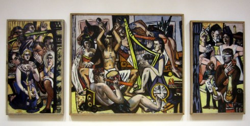
Never mind whatever was hanging above it. Meanwhile, get a load of this Max Beckmann and tell me if think it suffers from a lack of natural light:
Do we really wish it was hanging next to something like this just to satisfy architects’ natural-light fetish?
Steven Holl Architects, who will design the Museum of Fine Arts, Houston’s modern-and-contemporary building, made a lovely building for the Nelson-Atkins, but all the compromises were made by the art that’s inside and that takes forever to find. With Graves’s addition to the MIA, the compromises were made by the architect — and, no doubt, his ego — but the art shines, not just in his wing, but throughout the building. Back to Weinstein:
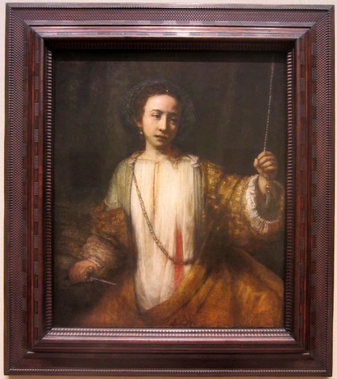
Weinstein says viewers should feel good inside the museum, even as they’re challenged by the art. The space should enhance their interest, and their ability to remember what they’ve seen. Weinstein says he experienced this himself, with a 17th-century portrait of the virtuous yet ill-fated Lucretia.
“I sat down in my most recent tour and just looked up at Rembrandt’s painting of this sweet, innocent young woman, and I was so taken with it,” says Weinstein. “I think that’s one of the best Rembrandts anywhere. I don’t think I ever focused on it as much as I did this last time.”
I’ll have more to say about the MIA’s mind-bogglingly good collection — see my Facebook photo album, which I’ll continue to add to, here — and how the museum works to engage viewers with it soon. For now, on to the Walker Art Center.


